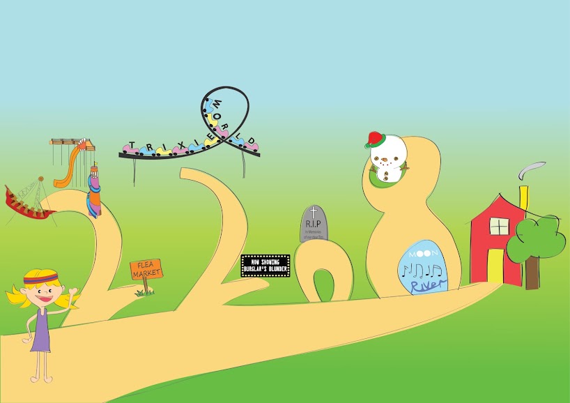
Monday

Wednesday, October 20, 2010

Stage 1

Storybook Stage 1

My group mates and I have decided on a storyline for our storybook. Grace - she's our artist - has sketched out most of the drawings for me and weili - we are responsible for illustrating them out and colouring it. Sarah will be in charge of the design document. So here are some pictures of a baby bunny playing in his garden. We had different colour schemes for the bunny and playing around with different background colours before finalising.


Thursday, October 14, 2010

Moon River

I refined my abstraction process and added in the black and white biz card. I post it on Assignment 2 (refined).


Assignment 6 - Procedure

Friends from my class will realised that my assignment 6 is different. That is because I redid the entire thing. I picked new lyrics and did a more organised layout. I played around with alot of different fonts, placement of fonts.

Lyrics from the classic Moon River by Audrey Hepburn.

" Two drifters, off to see the world. There's such a lot of world to see. We're after the same rainbow's end, waiting around the bend, my huckleberry friend, Moon River and me."

Align Center

- I wanted to adopt the concept of a new chapter. I got the idea from this image that I googled:


So, I search from fonts from da font and fontspace, downloaded one that is called "SPACECAPS" and hence that forms my first letter "T".

- I usually associate the word drifters with drift wood. So I used a "drift-wood" font. I initially wanted to do something cursive to represent the "drifting away" feeling.

- "SEE" is from a font called "JI Chubby Caps" and I drew in the eyes.

- I love the font for "WORLD" and "My Huckleberry Friend", it's one of my favourite font. "Rhubarb Pie".

- The words on the road is "freestyle script".

- I positioned the letters from "AFTER" such that it is one after another

- "RAINBOW'S END" is by "Jokerman". I chose to use a more fun and whimsical font to company with the rainbow.

- I used "McKloud" font for waiting and drew a girl's face. If you remember the lyrics, the two drifters went to see the world and met each other around the bend. I used "Seasons-Spring" font for around the bend and placed it to portray the "bending" image.

- "MOON". I drew moons for the "O's" while the other letters are from the font "Space and Astronomy". I did a black background for it to represent night sky and gradient the black background so that there's a white glow. This white glows continues for the word "RIVER", where the background is ocean-blue. I have trouble finding a font for "RIVER".

So that's it for assignment 6. I still think I can do better. Appreciate comments.

Monday, October 4, 2010

Post card

Assignment 5 - Festive Postcard

I started off thinking about snow angels. I thought just having a kid doing snow angel might be lonely, so I drew a dog doing snow angel. After that I drew a snowman and next to it is a sign that says "Merry Christmas".


First of all, deciding the theme and what colour to choose was very tedious and tiring. It took me awhile to do some of the shading and unshading, undo and redo several times and I did a lot of trial-and-error to try and get the best colour results. So finally I managed to churn out 9 colour themes. They are: Cool, Warm, Night, Bright, Earthy, Festive, Autumn, Nature, Mystery. (click on picture if you can't see clearly.)

Things that I didn't change throughout are the boy's hair and face, the colour of the dog, sign post and snowman.

AND.. I think I failed the 4C requirement.


I'm deciding between Warm and Night.

Next is the back of the postcard. I tried a few fonts and these are some that I came up with. I like the 3rd and 4th font alot.


Ok, so the final postcard should look like this:


My brother says the postcard seemed like there were too many things, he prefers a very simplistic postcard (initially, I wanted to put a house at the top right hand corner), I'm still unsure though, so let me knwo what you think. :):)

Friday, October 1, 2010

Hue

Lecture 7

This is the second part of the lecture -colours. I learnt about the different components of colour - hue, value, intensity, temperature. I never knew white is not considered a colour till lecture day. Julian also showed us how to use illustrator to get different colours, which I thought was very useful, but sad to say, I can't remember how.

Also, I learnt about the different colour schemes such as complement, warm, cool, triad, analogous... Some past examples of postcards were also shown.

That's about it for Colours.

Wednesday, September 29, 2010

Anorexia

Assignment 4 - Fear Poster


I did on Male Anorexia. I took a picture of a male friend. His rib cage is portruding already, so I just photoshop it a little more to make him seem more anorexic. My poster has a storyline. It introduces this guy named Jim, his weight and height, and that he died at the age of 30 of severe malnutrition. Then I put in some stats, a slogan and finally some contact information at the bottom of the page. For the slogan "FIGHT ANOREXIA", I added a skull-and-bones image to represent the letter "X". I took a snap shot of it from a key chain photoshop it onto a black background and place it in the poster.

I was concerned with the type of colours I used for my text but nobody said anything. I didn't know whether did I use too many colours or right colour. I want to keep the "FIGHT ANOREXIA" in red because it stands out. My font type isn't fantastic either so I will play around.

Feedback from my friends was that I could possibly make the picture bigger and exaggerate the number "15". The poster didn't seem impactful if only 15 males died every year. And I could add a white border at the bottom of the picture. I'm still not pleased with the poster interms of aesthetic, so I will experiment with different fonts, colour and placement.

Thursday, September 16, 2010

Sick

I am sick since Tuesday. Sorry for no updates for lecture 6 today.

Photographs

Assignment 3 - You See What I See.


Here's what really happened. (This was supposed to be portrayed during night time, I had to adjust the lighting as I had feedback that it was too dark.)

Page 1

Picture 1 - Guy wears a hoodie and climbs through a window.
Picture 2: Guy starts ransacking drawers.
Picture 3: He seems to have found something finally (deemed by the light shone from inside of the drawer; the light was supposed to be yellow/golden and I'm not too sure how to change that).
Picture 4: He steals and puts them in his little sack.

Page 2

Picture 5: He escapes, carrying over his back his little sack of goodies.
Picture 6: Happily walking after escaping.
Picture 7: He opens the bag and is shocked to discover that...
Picture 8: ...in it contains Monopoly money.


Storyboard.

I had MANY difficulties, most of them came from capturing images in the dark. They don't turn out well and the result was I had to photoshop them alot. So I retook the pictures and hopefully they look better than they used to. I couldn't angle my shots properly and they all turn out the same, at similar angles.