These are my drafts.
The pictures speak for themselves. My initial sketches were extremely messy, they were everywhere.

After I had a better idea of what to sketch and where the bits and pieces should go, I drew them out nicely, four a paper. The first concept is I like books.

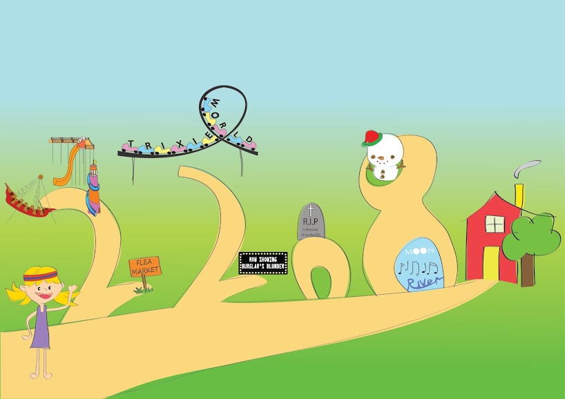
The second concept is I like themeparks. For the bottom left picture, need to tilt it to the right to see my name.

After that, I thought it will be better to complement it with colour so it will not only look neater, it will also help me with my choice of colours. I refined the "themepark" by substituting my name with other rides, the idea was to have different rides. For the "books", I played around with the characters and paid attention to the details.


Generally my peers said the sketches were all alright. But I definitely need to work on the letter "A" for all of them. The "A" for Viking - the support stand needs to be a little thicker and darker. The "a" for Roller Coaster needs a change, because it looks like an "e". Even the "a" represented by the baby looks weird. The "a" should look like a Georgia font "a".
***Grumbles. Why!!?!??!?!?!??! Of all letters, it had to be "A"!!!?!??!?!?! Grumbles.***
Anyway I will be doing the themepark; still mixing and matching the different "rides" for the respective letters, put them on illustrator (GOD PLEASE GIVE ME THE SKILLS), polish it off with a nice background (I'm thinking little people on grass and the rides themselves plus a sun of course, so the whole picture will look more natural and real). I will think of another background just in case I screw up the initial plan.
I will make this work. This must work.
PS: If I should change anything else, please please please let me know. I am always grateful for comments, help, etc.
No comments:
Post a Comment