Monday

Saturday, November 6, 2010

Storybook - Little Harry and Granny


I encountered some difficulties while uploading the files. So I had to grab Grace's copy (therefore her website address on the picture). Thanks grace!

I am in charge of the CG and colouring of the storybook. We decided to go with weili's (another partner doing CG and colouring) idea, inspired based on his real life experience.

Storyline:

little Harry wasn't appreciative of his granny, and one day while playing outside, he fell down and hurt himself. Granny came to help him up and sew his torn bib back. Little Harry was very happy. As Little Harry grew up and older, went to school and graduated and to work, he decided that he should visit granny one day. So off he went back to his granny's house and again, along the way, he tore his tie. Granny once again help him sew back but this time, she faced many difficulties due to poor eyesight. Little Harry noticed that the house was also in a mess. He thought to himself that he needs to help granny this time. He bought her new specs, clean up the house and cook dishes for granny. He promised that he will take care of granny and the story ends with them being happy and living with each other together.

We added a postcard to increase interactivity. Children can simply tear out the post card and write messages and mail to their granny.

We choose Little Harry after considering names such as Bobby, Little Joe. But Little Harry was the perfect match when we formed the title "Little Harry and Granny."

Assignment 6 (Final)

Before After


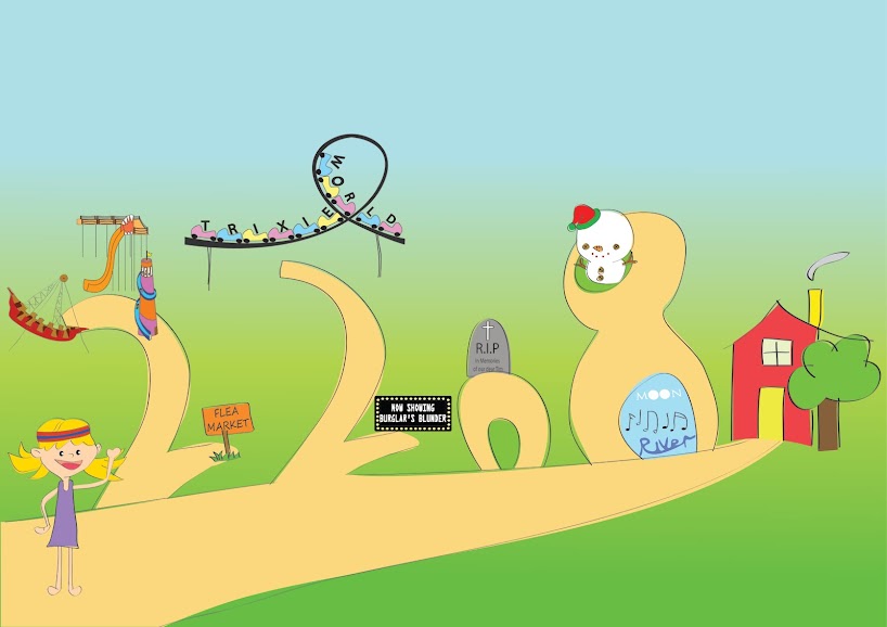
Audrey Hepburn's classic song Moon River.

I did not change much. My only worry for this piece is that there are too many colours but the feedback I received was that it was ok. I changed the word "river" because before that no one could read it.

I added other details such as iconic monuments (great wall, effiel tower, tower of pissa) to represent "such a lot of world to see".

I also changed the "two" because feedback was that it was not related. So I changed the font to "drift font" - same as the word "drifters".

Assignment 5 (Final)


I added snowflakes to the postcard pictures and enlarged the sign "Merry Christmas". Hope it looks bigger now.

I also changed the back of the postcard to make it look more fun and less boring. The intention is to attract more kids.

After spending much time looking at crystalised snowflakes, I created them at the back of the postcard and I'm considering to change the "dots-snowflakes" into crystlised ones for the front of the postcards.

Assignment 4 (Final)

Before After


This assignment took me awhile to refine it. Here's the before and after. The whole structuring and layout has changed. I didn't change much of the anorexia guy.

Photoshop help websites from Youtube, Google advised that I don't "pucker" the real picture too much otherwise it will not look realistic.

I played with the layout, font and colours. I decided to do away with the crossbone-and-skull image as it loeked like there were too many things in place, and the crossbone-and-skull image could also be associated to smoking or drugs. Here I think simplistic works best.

Assignment 3 (Final)


I restructured it so that it looks like a comic strip.
I follow the american comic style which is to read LEFT TO RIGHT.
After looking at examples of comics from the internet, I also added "issue number", "created by __" to make it more like a comic.

And here's the storyboard

Assignment 2 (Final)

Abstraction Process

I redid the namecards and came up with a new boilerplate about the company.


Namecard 1

front


back


front (black and white)


back (Black and white)


Namecard 2


front


back


front (black and white)

The black and white back for namecard 2 is the same as the back for the coloured back namecard 2.

About Trixie World

Trixie World was built in 1989, since then it has undergone several transformations to become the best themepark inthe world. Located in Sentosa, Singapore, the themepark overseas a breathtaking ocean view. Well known for their rides such as “Devil’s Ride”, “Oh So Splashy”, “Twister Tower”, Trixie World has become a favourite among people. As such, the themepark has gained recognition and won quality control awards.

President and CEO of Trixie World, Johnny Tay looks forward to each day when the themepark opens. He said, “we have a motto that is to provide endless fun for patrons of Trixie World. Therefore we strive in providing excellent service and exciting rides to them.”

In 2008, Trixie World attracted a record of 1 million people and to celebrate this acheivement, the themepark organised its first and very own fireworks show and gave away free ice-cream to everyone.

Assignment 1 (Final)

Before


After


This is the final work for Assignment 1.

I changed the colours mostly, especially for "I love themeparks". The feedback I received was that the colours for my name didn't stand out because the whole thing was itself very colourful.

I did not really alter much for "I love reading" but after consulting, I think that I may need to change it. I am unable to post the pictures yet, but you may see changes in portfolio.

Wednesday, October 20, 2010

Stage 1

Storybook Stage 1

My group mates and I have decided on a storyline for our storybook. Grace - she's our artist - has sketched out most of the drawings for me and weili - we are responsible for illustrating them out and colouring it. Sarah will be in charge of the design document. So here are some pictures of a baby bunny playing in his garden. We had different colour schemes for the bunny and playing around with different background colours before finalising.


Thursday, October 14, 2010

Moon River

I refined my abstraction process and added in the black and white biz card. I post it on Assignment 2 (refined).


Assignment 6 - Procedure

Friends from my class will realised that my assignment 6 is different. That is because I redid the entire thing. I picked new lyrics and did a more organised layout. I played around with alot of different fonts, placement of fonts.

Lyrics from the classic Moon River by Audrey Hepburn.

" Two drifters, off to see the world. There's such a lot of world to see. We're after the same rainbow's end, waiting around the bend, my huckleberry friend, Moon River and me."

Align Center

- I wanted to adopt the concept of a new chapter. I got the idea from this image that I googled:


So, I search from fonts from da font and fontspace, downloaded one that is called "SPACECAPS" and hence that forms my first letter "T".

- I usually associate the word drifters with drift wood. So I used a "drift-wood" font. I initially wanted to do something cursive to represent the "drifting away" feeling.

- "SEE" is from a font called "JI Chubby Caps" and I drew in the eyes.

- I love the font for "WORLD" and "My Huckleberry Friend", it's one of my favourite font. "Rhubarb Pie".

- The words on the road is "freestyle script".

- I positioned the letters from "AFTER" such that it is one after another

- "RAINBOW'S END" is by "Jokerman". I chose to use a more fun and whimsical font to company with the rainbow.

- I used "McKloud" font for waiting and drew a girl's face. If you remember the lyrics, the two drifters went to see the world and met each other around the bend. I used "Seasons-Spring" font for around the bend and placed it to portray the "bending" image.

- "MOON". I drew moons for the "O's" while the other letters are from the font "Space and Astronomy". I did a black background for it to represent night sky and gradient the black background so that there's a white glow. This white glows continues for the word "RIVER", where the background is ocean-blue. I have trouble finding a font for "RIVER".

So that's it for assignment 6. I still think I can do better. Appreciate comments.

Monday, October 4, 2010

Post card

Assignment 5 - Festive Postcard

I started off thinking about snow angels. I thought just having a kid doing snow angel might be lonely, so I drew a dog doing snow angel. After that I drew a snowman and next to it is a sign that says "Merry Christmas".


First of all, deciding the theme and what colour to choose was very tedious and tiring. It took me awhile to do some of the shading and unshading, undo and redo several times and I did a lot of trial-and-error to try and get the best colour results. So finally I managed to churn out 9 colour themes. They are: Cool, Warm, Night, Bright, Earthy, Festive, Autumn, Nature, Mystery. (click on picture if you can't see clearly.)

Things that I didn't change throughout are the boy's hair and face, the colour of the dog, sign post and snowman.

AND.. I think I failed the 4C requirement.


I'm deciding between Warm and Night.

Next is the back of the postcard. I tried a few fonts and these are some that I came up with. I like the 3rd and 4th font alot.


Ok, so the final postcard should look like this:


My brother says the postcard seemed like there were too many things, he prefers a very simplistic postcard (initially, I wanted to put a house at the top right hand corner), I'm still unsure though, so let me knwo what you think. :):)

Friday, October 1, 2010

Hue

Lecture 7

This is the second part of the lecture -colours. I learnt about the different components of colour - hue, value, intensity, temperature. I never knew white is not considered a colour till lecture day. Julian also showed us how to use illustrator to get different colours, which I thought was very useful, but sad to say, I can't remember how.

Also, I learnt about the different colour schemes such as complement, warm, cool, triad, analogous... Some past examples of postcards were also shown.

That's about it for Colours.

Wednesday, September 29, 2010

Anorexia

Assignment 4 - Fear Poster


I did on Male Anorexia. I took a picture of a male friend. His rib cage is portruding already, so I just photoshop it a little more to make him seem more anorexic. My poster has a storyline. It introduces this guy named Jim, his weight and height, and that he died at the age of 30 of severe malnutrition. Then I put in some stats, a slogan and finally some contact information at the bottom of the page. For the slogan "FIGHT ANOREXIA", I added a skull-and-bones image to represent the letter "X". I took a snap shot of it from a key chain photoshop it onto a black background and place it in the poster.

I was concerned with the type of colours I used for my text but nobody said anything. I didn't know whether did I use too many colours or right colour. I want to keep the "FIGHT ANOREXIA" in red because it stands out. My font type isn't fantastic either so I will play around.

Feedback from my friends was that I could possibly make the picture bigger and exaggerate the number "15". The poster didn't seem impactful if only 15 males died every year. And I could add a white border at the bottom of the picture. I'm still not pleased with the poster interms of aesthetic, so I will experiment with different fonts, colour and placement.

Thursday, September 16, 2010

Sick

I am sick since Tuesday. Sorry for no updates for lecture 6 today.

Photographs

Assignment 3 - You See What I See.


Here's what really happened. (This was supposed to be portrayed during night time, I had to adjust the lighting as I had feedback that it was too dark.)

Page 1

Picture 1 - Guy wears a hoodie and climbs through a window.
Picture 2: Guy starts ransacking drawers.
Picture 3: He seems to have found something finally (deemed by the light shone from inside of the drawer; the light was supposed to be yellow/golden and I'm not too sure how to change that).
Picture 4: He steals and puts them in his little sack.

Page 2

Picture 5: He escapes, carrying over his back his little sack of goodies.
Picture 6: Happily walking after escaping.
Picture 7: He opens the bag and is shocked to discover that...
Picture 8: ...in it contains Monopoly money.


Storyboard.

I had MANY difficulties, most of them came from capturing images in the dark. They don't turn out well and the result was I had to photoshop them alot. So I retook the pictures and hopefully they look better than they used to. I couldn't angle my shots properly and they all turn out the same, at similar angles.

Thursday, September 9, 2010

Angles

Lecture 5

There wasn't any sms system today but there was an opinion poll. It was a refreshing change because for the first time I could answer the questions in 1 sec. Haha.


I learnt quite alot today, almost overwhelming for me because I'm not really a camera-loving person. Taking pictures is not my thing, so there were a lot of considerations that I have to look into when doing assignment 3 for example, the different interpretations that a camera can reveal through different angles and positions or even when to take a long range shot or a face shot and where to focus on. Photography work does involve lots of hard work after all.

Wednesday, September 8, 2010

Abstraction

Assignment 2 - Degree of Abstraction


After the generous feedback from class, I conclude that my abstraction wasn't really a "true" abstraction. I think it's because my original picture wasn't very clear especially the details of the train and the people on it. I could see the outline of the train but it wasn't good enough. Siti also said that my 5th picture should be the last abstraction (the one with one line and a long rectangle) because it looks pretty abstract, so I need to add another layer of abstraction somewhere in between pictures 1-4.

My initial plan was to use the 4th picture for my business card and I had another version for it. But the class still prefer the original one which is (A).


(A)


(B)


So this is my revised business card. I cropped the roller coaster image and added details of my name, designation, contact number and email. The very small words on the bottom right is "Legendary Themepark Copyright 1988" and the website's address.


front


back

Legendary Themepark is a family business company run by the Tay family and ever since its debut in 1998, it has become a thriving corporation. We specialize in building themeparks and we pride ourselves in constructing fun and thrilling rides that will leave the public craving for more. Some of our finest rides include roller coasters, viking ships, water slides, and tower slides. Our emblem – a roller coaster image, is attributed to our trademark for building roller coasters with many loops. Our best roller coaster - “Devil’s Ride” of ESCAPE II in Singapore, has 6 loops and plunging drops. The Managing Director is Tommy Tay, an enthusiast of themeparks himself, he aims to make Asia the most sought-after place for themeparks lovers. With prominent awards, a good track record and supportive feedback, we have become one of the leading themepark companies in Asia. At present, we have constructed 7 themeparks in Asia. Legendary’s proposal for an 8th themepark was recently approved by Taiwan’s government and we will soon progress with the building of another magnificent themepark on a land size of 37 hectares that overlooks a breathtaking ocean view. For further information, please visit our website www.legendarythemepark.com.


I think I still need to refine this assignment and I will post it up as soon as I'm done with it. So please bear with me for a while longer, this isn't the final!

Saturday, September 4, 2010

Drink

Lecture 4

This is the little in-class assignment Fei Zhen and I did during lecture.


Our item was a can of drink that was sitting on my desk.


The idexis part is the can cap.


Lecture 4 was full of "-grams". I got a little confused differentiating terms like iconogram, logogram and pictogram.

Wednesday, September 1, 2010

Background

Assignment 1 - Me, Myself and I (in CG)


Sorry about the picture being a little blur. Please zoom in.

"I love themeparks" is one assignment that took up half my weekend. I chose a green grassy background and added a ferris wheel to try and portray that there weren't only three rides, yet at the same time I didn't want to put too many other rides. I also added ice cream vans, a ticket booth, some trees and tents. There were many little details I had to draw in and carefully place them on the correct layer as colouring and overlaping will affect the entire layout. So I drew everything on the illustrator, occassionally seeking inspiration fron online pictures (little cute people and ferris wheel) and then drew them again myself. After layers and layers of drawing, hours spent and strained eyes later, this is more or less the finished work. Of course there's still room for improvement.

"I love books" took me slightly lesser time but still it was equally difficult. The girl and the child were the most challenging and here I thought drawing cartoony people was a breeze. Sadly I was wrong. The background for this is a library setting with a shelf, the people and a pile of books on the floor (my name), as well as a signage on the wall declaring "Please be considerate and not sit on the floor. By Order of Library Management." Very cheesy humour I know.

So.. feedback.

Thank goodness the "A" in the books-theme is fine now. But the themepark's water slide "J" needs to end more curved and the "I" looks like an "A". I shouldn't have make it bigger. -.- I will edit and produce a better piece.

I'm happier with my work now, it looks more polished and neater. I finally got used to illustrator, which took me an insanely long time but I'm proud of myself. Right now, I'm desperately trying to get inspiration or think HARDER for assignment 2.

Friday, August 27, 2010

Colours

Lecture 3

During yesterday's lecture, we learnt about colours and what's CMYK and RGB. Julian's little video clip that he made himself was very helpful towards my learning journey of the
chim illustrator.

I thought of a few ideas for the final prototype and I can't wait to show to class. :)

Wednesday, August 25, 2010

Sketches

Assignment 1 - Me, Myself and I (sketches)

These are my drafts.


The pictures speak for themselves. My initial sketches were extremely messy, they were
everywhere.


After I had a better idea of what to sketch and where the bits and pieces should go, I drew them out nicely, four a paper. The first concept is I like books.


The second concept is I like themeparks. For the bottom left picture, need to tilt it to the right to see my name.


After that, I thought it will be better to complement it with colour so it will not only look neater, it will also help me with my choice of colours.
I refined the "themepark" by substituting my name with other rides, the idea was to have different rides. For the "books", I played around with the characters and paid attention to the details.


Generally my peers said the sketches were all alright. But I definitely need to work on the letter "A" for all of them. The "A" for Viking - the support stand needs to be a little thicker and darker. The "a" for Roller Coaster needs a change, because it looks like an "e". Even the "a" represented by the baby looks weird. The "a" should look like a Georgia font "a".

***Grumbles. Why!!?!??!?!?!??! Of all letters, it had to be "A"!!!?!??!?!?! Grumbles.***


Anyway I will be doing the themepark; still mixing and matching the different "rides" for the respective letters, put them on illustrator (GOD PLEASE GIVE ME THE SKILLS), polish it off with a nice background (I'm thinking little people on grass and the rides themselves plus a sun of course, so the whole picture will look more natural and real). I will think of another background just in case I screw up the initial plan.


I will make this work.
This must work.

PS: If I should change anything else, please please please let me know. I am always grateful for comments, help, etc.